• Folks, if you've recently upgraded or renewed your annual club membership but it's still not active, please reach out to the BOD or a moderator. The PayPal system has a slight bug which it doesn't allow it to activate the account on it's own.

Boredom pic

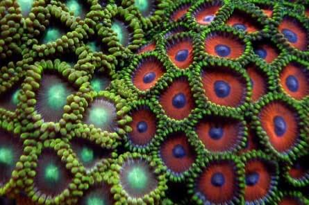
This is a pic I just took, critique it, not the subject but what I could have done to make it a better pic of the subject. Keep in mind I'm limited to a Sony Cybershot 7.2 camera.

233_03_11_07_5_41_55.jpg
 

Brian

Officer Emeritus
Officer Emeritus
I dunno what you could do to make it better Francis, it looks great!
 
Francis that picture is awesome :eek: there nothing else to do to it , that could be a winner in the monthly contest .
 

Phyl

Officer Emeritus
Officer Emeritus
Picture looks really good, Francis. There are some "hot spots" or "blown highlights" where the picture is slightly overexposed. Looks like there might be a hint of motion blur to the photo, so putting the cam on a cheap tri-pod may have improved the focus a hair. Overall I think the composition is great, the subject matter is eye catching. I could see voting for that photo in the contest (except that you've shown it now ;) ).
 
I think that picture is awesome ... the kind you would put on a Calender *ehem* or something.

I took it into photo shop and played around cause i'm a nerd. None of these are necessary but the crop is actually just cutting off the parts that aren't as nice. And to answer your question, cropping is the only thing that would better focus on the subject. The rest are just effects that you click a button and they happen. Nothing special. Here's what I did. (No effect will ever look as good as the real photo. Just something fun to play with)

A simple crop:
sinkcroped.jpg


A glo effect:
sinkgloedge.jpg


A brush effect:
sinkbrush.jpg


A mosaic effect:
sinkmosaic.jpg
 
I might have done couple of things:

First, I would crop the bottom and top 15-20% which a) look a bit blured and b) have those white areas from the rock which are attention grabbers. Similar to what NapoliNewJersey did except that I would leave the left and right borders as untrimmed as possible. This way you get the flow perspective and their merger more natural.

Second, I would increase the contrast or sharpness a bit. The light green areas in the center of the polyps on the left look a bit dizzying blurry to me (though I might just have a bad case of Mondays), so I would try to bring more of those radial lines in them. At the same time I have also intensified midtones a bit, just to make the red-blue contrast of colors a bit more dramatic.
 
Top